All Blogs/Web Development
26 Sept 2025
17 min read

HTML & CSS for 2025: Build Visually Stunning, Conversion-Driven Websites

HTML & CSS for 2025: Build Visually Stunning, Conversion-Driven Websites

By: Martian Corporation

Article content

Introduction

HTML & CSS for 2025: Build Visually Stunning, Conversion-Driven Websites

Web developers and designers need to master the latest HTML5 best practices 2025 and CSS techniques to create websites that not only look amazing but actually convert visitors into customers. The digital landscape moves fast, and outdated coding practices can hurt both user experience and search rankings.

This guide is perfect for front-end developers, web designers, and business owners who want to build professional websites that perform. You'll discover how semantic HTML creates better accessibility and SEO results, while responsive CSS keeps your site looking sharp on every device.

We'll dive deep into mastering Flexbox and Grid layout systems that give you complete control over modern layouts. You'll also learn conversion-focused design principles that turn browsers into buyers, plus performance optimization tricks that make your sites load lightning-fast. Ready to build websites that actually work for your business goals? Let's get started.
Modern HTML5 Semantic Structure for Enhanced User Experience

Implement semantic tags to boost accessibility and SEO rankings

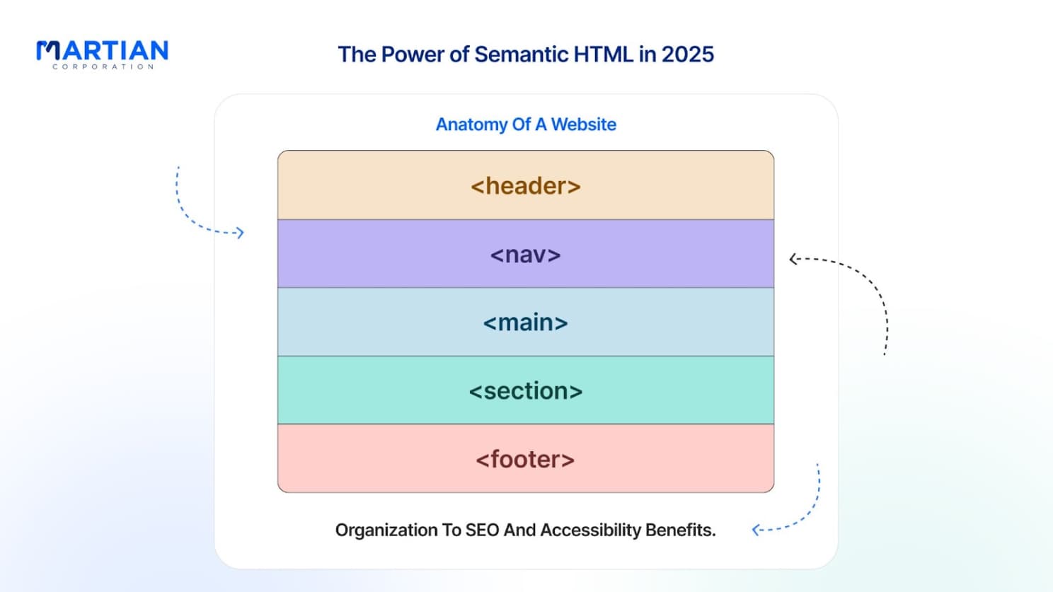
Semantic HTML tags are your secret weapon for creating websites that both search engines and screen readers absolutely love. When you use tags like <header>, <nav>, <main>, <article>, <section>, and <footer> instead of generic <div> elements, you're giving meaning to your content structure. Search engines can instantly understand what each part of your page represents, which directly improves your SEO rankings.

The <article> tag works perfectly for blog posts, product descriptions, or news stories - any content that stands alone. Wrap related content in <section> tags, and use <aside> for sidebar content or supplementary information. Don't forget <time> tags for dates and <address> for contact information. These semantic HTML elements create a clear content hierarchy that screen readers navigate effortlessly, making your site accessible to users with disabilities.

Navigation becomes crystal clear when you properly structure it with <nav> elements containing unordered lists. Search engines recognize this pattern and can better understand your site's structure and important pages.

Article content

Create flexible layouts with proper document structure

Building flexible layouts starts with establishing a rock-solid document structure that adapts to any content length or screen size. Your HTML should follow a logical flow that makes sense even without CSS styling. Start with a clear hierarchy using heading tags (<h1> through <h6>) in proper order - never skip levels.

Container elements like <main>, <header>, and <footer> provide natural breakpoints for your layout. Inside these containers, use <section> and <article> tags to create content blocks that can be styled independently. This approach gives you incredible flexibility when applying responsive CSS later.

Think about content relationships when structuring your HTML. Related items should be grouped together, and important content should appear higher in the document structure. This logical organization makes it easier to apply Grid layout and Flexbox positioning without fighting against your HTML structure.

Optimize loading speeds through clean HTML architecture

Clean HTML architecture directly impacts your site's loading speed and performance scores. Minimize nested elements and avoid unnecessary wrapper divs that add bulk without purpose. Every extra tag increases parsing time and DOM size, which slows down rendering.

Structure your document so critical above-the-fold content appears early in the HTML. This allows browsers to start rendering important elements while still downloading the rest of the page.

Validate your HTML regularly to catch errors that might slow down parsing. Browsers have to work harder when they encounter malformed markup, which impacts loading performance.

Build mobile-first responsive foundations

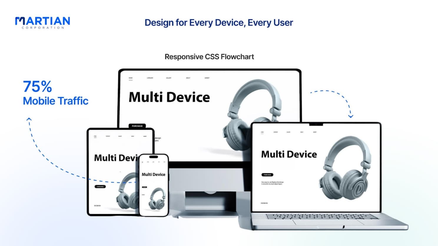
Mobile-first responsive design starts in your HTML structure, not your CSS. Design your document hierarchy with mobile users in mind, keeping the most important content at the top and secondary information below. This ensures mobile users get what they need quickly without excessive scrolling.

Use flexible container structures that work naturally on small screens. Avoid fixed-width elements in your HTML that might force horizontal scrolling. Instead, let your semantic structure flow naturally and handle sizing through CSS.

Consider touch interaction when structuring interactive elements. Make sure buttons and links have enough surrounding space in your HTML structure to accommodate CSS padding that creates proper touch targets. Group related interactive elements together to create logical tap zones.

Your HTML5 best practices 2025 should include proper viewport meta tags and ensure all images have appropriate alt text. Structure forms with proper labels and fieldsets for better mobile usability. These HTML foundations make responsive CSS implementation much smoother and more effective.

Article content

Advanced CSS Grid and Flexbox Mastery for Professional Layouts

Design complex multi-column layouts with CSS Grid

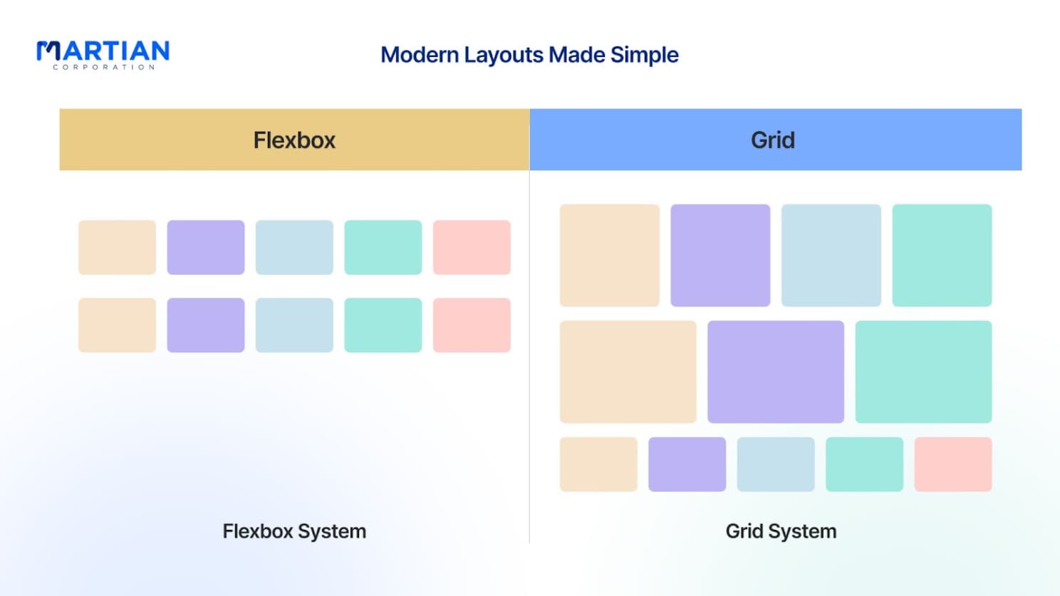
CSS Grid layout transforms how we approach complex web designs in 2025. Unlike traditional float-based layouts, Grid layout gives you precise control over both rows and columns simultaneously. Start by defining your grid container with display: grid, then use grid-template-columns and grid-template-rows to establish your layout structure.

Perfect component alignment using Flexbox techniques

Flexbox excels at component-level alignment where you need perfect control over individual elements. The key to mastering responsive CSS with Flexbox lies in understanding its alignment properties. Use justify-content for main-axis alignment and align-items for cross-axis alignment.

Article content

Create responsive designs without media query overload

Modern responsive CSS reduces media query dependence through intrinsic web design principles.

Container queries represent the future of responsive design. Use @container rules to make components respond to their container size rather than viewport dimensions. This creates truly modular components that work anywhere in your layout.

Implement dynamic spacing and proportional sizing

Dynamic spacing systems use CSS custom properties and calc() functions to maintain consistent proportions. Logical properties like margin-inline and padding-block create spacing that adapts to different writing modes automatically, essential for international websites in 2025.

CSS Custom Properties and Modern Styling Techniques

Article content

Build scalable design systems with CSS variables

CSS custom properties have revolutionised how developers approach design consistency. These powerful tools let you define reusable values that cascade throughout your entire project, making updates instant and maintenance a breeze.

Typography scales become incredibly manageable with variables. Create a modular scale that maintains visual harmony across all screen sizes. You can even use CSS calc() functions to create dynamic relationships between your type sizes.

Dark mode implementations become trivial when your entire design system relies on custom properties. Simply override your color variables within a media query or class selector, and your entire interface transforms seamlessly.

Component-level custom properties take this concept further. Each component can define its own local variables while inheriting global ones, creating a flexible hierarchy that prevents design inconsistencies while allowing for customization.

Implement smooth animations and micro-interactions

Modern web experiences demand subtle animations that guide users and provide visual feedback. CSS transitions and animations have matured into sophisticated tools that can create professional-grade interactions without JavaScript overhead.

Transform properties are your best friend for smooth animations. They trigger hardware acceleration, ensuring buttery-smooth performance even on mobile devices. Focus on animating transform properties like translateX, scale, and rotate rather than layout properties that cause expensive reflows.

Micro-interactions add personality to your interfaces. A subtle scale animation on button hover, a gentle bounce when loading completes, or a smooth slide-in for notifications all contribute to a polished user experience.

CSS keyframes unlock complex animation sequences. Create loading spinners, progress indicators, and attention-grabbing effects that run purely in CSS. The animation-play-state property lets you pause and resume animations dynamically, perfect for creating interactive elements.

Intersection Observer API paired with CSS animations creates scroll-triggered effects that feel natural and performant. Elements fade in, slide up, or scale as they enter the viewport, adding layers of visual interest without impacting page performance.

Create stunning visual effects with advanced selectors

CSS selectors have evolved far beyond basic class and ID targeting. Advanced selectors give you surgical precision over styling, enabling complex visual effects and interactions without cluttering your HTML with extra classes.

Attribute selectors unlock powerful styling opportunities. Target inputs based on their type, style links based on their destination, or create visual indicators for different file types. These selectors reduce the need for additional classes while making your CSS more semantic.

The :has() selector, now widely supported, brings parent selection to CSS. Style containers based on their contents, create layout variations based on child elements, or build adaptive components that respond to their internal state.

Pseudo-elements like ::before and ::after act as free design elements. Create decorative borders, add icons without images, or build complex shapes using pure CSS. These elements don't add to your HTML weight but provide unlimited styling possibilities.

Optimize performance through efficient CSS organization

CSS architecture directly impacts your website's performance and maintainability. Smart organization strategies reduce file sizes, improve parsing speed, and make your code more manageable as projects scale.

The cascade is your friend when used strategically. Structure your CSS to take advantage of inheritance rather than fighting it. Global styles should handle typography and spacing fundamentals, while component styles focus on specific visual treatments.

CSS bundling and minification are essential for production sites. Tools like PostCSS can remove unused styles, combine media queries, and optimize vendor prefixes automatically. Critical CSS inlining ensures above-the-fold content renders immediately while non-critical styles load asynchronously.

Logical properties like margin-inline-start replace directional properties like margin-left, making your CSS more robust for international sites with right-to-left languages. These properties reduce code duplication and improve maintainability across different writing modes.

CSS containment using the contain property tells browsers which elements are independent, allowing for more aggressive optimization. Layout, style, and paint containment can significantly improve rendering performance for complex components.

Conversion-Focused Design Principles Through CSS

Design Attention-Grabbing Call-to-Action Buttons

Your CTA buttons can make or break conversions. Start with size - they should be large enough to catch attention without overwhelming your design. Use padding generously (at least 12px vertical, 24px horizontal) to create comfortable click targets. Border-radius of 4-8px adds modern appeal without going overboard.

Color contrast is crucial. Your CTA should stand out against the background with at least 4.5:1 contrast ratio for accessibility. Consider using complementary colors - if your primary brand color is blue, an orange CTA creates natural visual tension that draws eyes.

Animation adds personality. Subtle hover effects like gentle elevation or color shifts create engagement without being distracting. Avoid overly flashy animations that might seem unprofessional.

Create Trust-Building Visual Hierarchy Patterns

Visual hierarchy guides users through your content naturally. Start with typography scales that create clear information layers. Use heading sizes that decrease logically (h1: 2.5rem, h2: 2rem, h3: 1.5rem) with consistent line-height ratios around 1.4-1.6.

Whitespace builds trust by making content digestible. Give your elements room to breathe - cramped layouts feel desperate and unprofessional. Use margins consistently throughout your design, creating rhythm that feels intentional.

Cards and containers with subtle shadows create depth perception that feels premium. Use box-shadow values around 0 2px 10px rgba(0,0,0,0.1) for subtle elevation that doesn't scream "notice me" but still adds visual interest.

Group related information using borders, background colors, or spacing. When testimonials sit in light gray containers with rounded corners, they feel more credible than plain text scattered across the page.

Implement Persuasive Color Psychology Techniques

Colors trigger emotional responses that directly impact conversion rates. Red creates urgency and excitement - perfect for limited-time offers or clearance sales. Blue builds trust and reliability, making it ideal for financial services or healthcare websites.

Green suggests growth, health, and go-ahead signals. It works beautifully for environmental brands, financial success stories, or any "proceed" actions. Orange combines the energy of red with the friendliness of yellow, creating enthusiasm without aggression.

Avoid color overload. Stick to 2-3 primary colors plus neutrals. Too many colors create visual chaos that reduces trust and makes decision-making harder. Your color palette should feel intentional and cohesive across all elements.

Consider cultural context if you serve global audiences. While white represents purity in Western cultures, it symbolizes mourning in some Eastern cultures. Research your target demographics to avoid unintentional negative associations.

Build Engaging Forms That Increase Completion Rates

Form design directly impacts completion rates. Single-column layouts outperform multi-column arrangements because they create a clear path forward. Users scan vertically naturally, so work with this behavior rather than against it.

Label placement matters enormously. Top-aligned labels scan 50% faster than left-aligned ones. Placeholder text should provide examples, not replace labels entirely. Screen readers can't always access placeholders, creating accessibility issues.

Progress indicators reduce abandonment on multi-step forms. Users need to know where they are in the process and how much remains. A simple progress bar or step counter sets clear expectations.

Error handling should be immediate and helpful. Validate fields as users complete them, not just on form submission. Red error messages should appear near the problematic field with specific guidance: "Password must contain at least 8 characters including one number" beats "Invalid password."

Make required fields obvious with asterisks or visual indicators. Optional fields should be labeled clearly to avoid confusion. When users understand expectations upfront, completion rates improve dramatically.

Performance Optimization Strategies for Faster Load Times

Minimize CSS file sizes through strategic organization

Your CSS files can quickly become bloated monsters that slow down your site. Breaking them down into smaller, purposeful chunks makes a huge difference. Start by creating separate stylesheets for different components - one for navigation, another for forms, and another for your main content areas.

Remove unused CSS ruthlessly. Most projects accumulate styles that nobody needs anymore. Tools like PurgeCSS automatically identify and remove dead code from your stylesheets. You can also use CSS minification tools that strip out comments, whitespace, and unnecessary characters, reducing file sizes by 30-40%.

Group related styles together and use CSS custom properties for repeated values. This approach keeps your code DRY (Don't Repeat Yourself) and makes maintenance easier. When you combine multiple CSS files, compress them using gzip compression on your server - most browsers support this and can reduce transfer sizes by up to 70%.

Implement critical CSS for above-the-fold content

Critical CSS focuses on the styles needed for content visible immediately when your page loads. Instead of waiting for entire stylesheets to download, users see a styled page right away. This technique dramatically improves perceived performance.

Extract styles for your header, navigation, hero sections, and initial content blocks into a separate critical CSS file. Inline this CSS directly in your HTML <head> section to eliminate additional HTTP requests. The remaining CSS can load asynchronously without blocking the initial render.

Responsive CSS plays a key role here since critical styles must work across different screen sizes. Use CSS Grid layout and Flexbox for your above-the-fold sections - they're efficient and create clean, fast-rendering layouts. Tools like Critical or Penthouse can automate the process of identifying which styles belong in your critical CSS.

Optimize images and media for web performance

Images often account for 60-70% of page weight, making them your biggest optimization opportunity. Choose the right format for each image type - WebP for photos, SVG for icons and simple graphics, and PNG only when transparency is essential.

Lazy loading prevents images below the fold from downloading until users scroll near them. Modern browsers support the loading="lazy" attribute natively. Combine this with CSS techniques that reserve space for images before they load, preventing layout shifts that hurt user experience and Core Web Vitals scores.

Cross-Browser Compatibility and Future-Proofing Methods

Ensure consistent rendering across all major browsers

Browser inconsistencies remain one of the biggest challenges developers face when creating websites. While modern browsers have significantly improved their standards compliance, subtle differences in how they interpret CSS can still break your carefully crafted designs. The key lies in understanding these differences and implementing strategies that work reliably across Chrome, Firefox, Safari, and Edge.

Testing across multiple browsers should be an integral part of your development workflow. Use browser developer tools to identify rendering differences early, and consider cloud-based testing platforms that provide access to various browser versions and operating systems. Pay special attention to CSS Grid layout and Flexbox implementations, as these powerful layout methods still show minor variations across browsers despite widespread support.

Implement progressive enhancement techniques

Progressive enhancement builds your website from the ground up, starting with a solid foundation of semantic HTML that works everywhere. This approach layers on CSS styling and JavaScript functionality as enhancements, rather than dependencies. If a browser doesn't support a particular CSS feature, users still get a functional, accessible experience.

Consider using CSS custom properties with fallbacks for older browsers. Define static values first, then override with custom properties where supported. This technique ensures your designs remain functional while taking advantage of modern CSS capabilities in browsers that support them.

Prepare for upcoming CSS features and standards

Staying ahead of the curve means keeping an eye on emerging CSS specifications and experimental features. Container queries are becoming mainstream, offering responsive design capabilities based on element dimensions rather than viewport size. Cascade layers provide better control over CSS specificity, making large codebases more maintainable.

The CSS Working Group continuously develops new features that will shape how we build websites. Subgrid is expanding Grid layout capabilities, while new color functions and color spaces are revolutionizing how we work with colors. CSS nesting is moving from preprocessors to native browser support, streamlining stylesheets.

Start experimenting with these features in non-critical projects using browser flags or behind feature detection. This preparation ensures you're ready to implement new capabilities as they gain broader browser support, keeping your skills and projects at the cutting edge.

Create fallbacks for legacy browser support

Despite modern browser dominance, legacy browser support remains necessary for many projects. Internet Explorer may be officially retired, but older versions of modern browsers still lack support for newer CSS features. Creating effective fallbacks ensures your websites remain accessible to all users.

Implement a mobile-first approach with progressive enhancement for responsive CSS. Use feature detection to provide alternative layouts for browsers without modern capabilities. For example, float-based layouts can serve as fallbacks for CSS Grid, while simple media queries can replace complex container query implementations.

Document your browser support requirements clearly and test your fallbacks regularly. Use tools like Browserstack or local virtual machines to verify that your fallback implementations provide acceptable user experiences. Remember that fallbacks don't need to be pixel-perfect matches - they just need to be functional and maintainable.

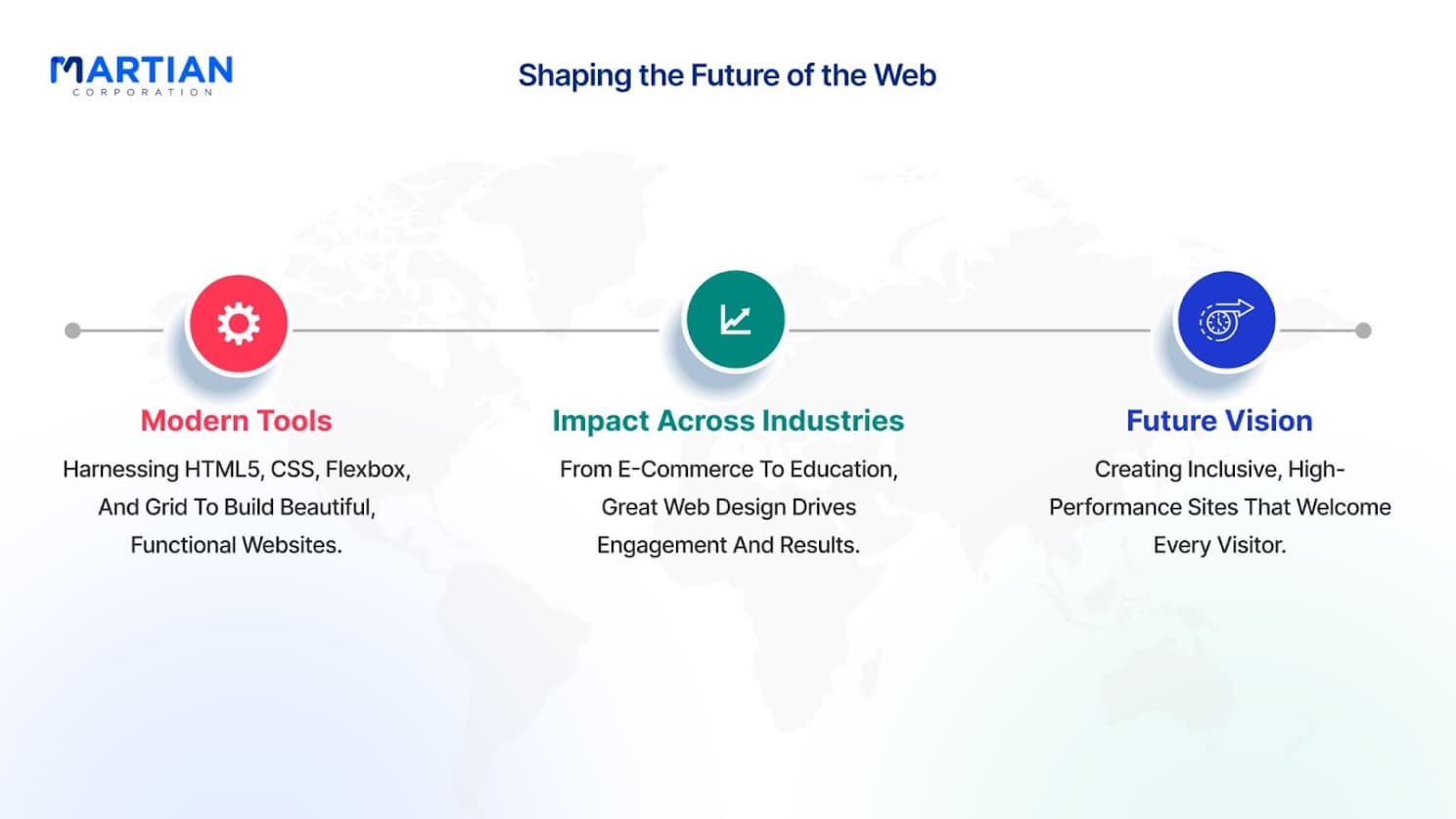
Mastering HTML and CSS in 2025 means embracing semantic HTML5 structures that make your sites more accessible and user-friendly. Combining this with advanced CSS Grid and Flexbox layouts, plus modern styling techniques like custom properties, gives you the tools to create professional websites that look great and perform even better. When you focus on conversion-driven design principles and optimize for speed, you're not just building pretty websites—you're creating digital experiences that actually drive results.

The web keeps evolving, but these fundamentals will serve you well into the future. Start implementing cross-browser compatibility practices now, and you'll save yourself headaches down the road. Whether you're redesigning an existing site or starting fresh, these HTML and CSS strategies will help you build websites that stand out, load fast, and convert visitors into customers.

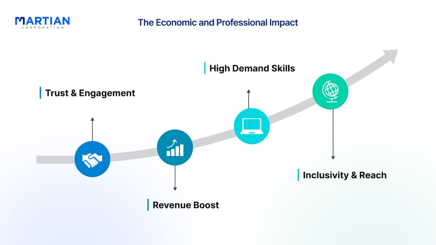
The Economic and Professional Impact

The way we build websites is changing everything about business. A well-designed site is a powerful tool that builds trust, keeps customers engaged, and directly boosts revenue. Because of this, the skills we've been talking about—semantic HTML, responsive CSS, Flexbox, and Grid—are more valuable than ever.

Conclusion

The impact is huge. Professionals with these skills are in high demand, from small startups to global companies. By focusing on inclusivity and building accessible sites, you're not just doing the right thing; you're reaching a larger audience and building brand loyalty.

As companies continue to invest in their digital presence, your expertise in these areas doesn't just make you a good developer—it makes you a valuable key player in any industry.

NewsLetter

Stay ahead in the world of technology

Get curated technology trends, expert analysis, and product updates delivered straight to your inbox — no noise, just signal.

Enter your email address

By subscribing you agree to our Terms and Conditions and Privacy Policy